Exploring canvas drawing techniques
Table Of Contents (toggle)I recently started working on adding some good-looking brushes to Fabric.js. We've had free drawing functionality for a while, but it was... laughable. Just a simple pencil of varying thickness. Far from anything you would see in those amazing drawing applications popping up in the last few years — Mr. doob's Harmony, deviantART's Muro, or mudcu.be Sketchpad. Freedrawing is one of the strongest points of canvas, so it's a shame not to have something good in a canvas library like Fabric.
 image by Krzysztof Banaś
I started experimenting with different styles and techniques — edge smoothing, bezier curves, ink and chalk and pen and stamp and patterns — oh my. Turns out there's not much written about this on the web. Not in the context of Javascript and <canvas>, anyway. The best you can do is look at the demos source code to get a glimpse of what's going on.
So I've got an idea to create sort of an interactive tutorial. Taking you from the very basics (drawing a primitive mouse-following-line on canvas), all the way to those harmony brushes, with their sophisticated curves and strokes, spanning from the edges and curling around into weirdly beautiful structures. The tutorial pretty much reflects my own path of exploration.
I'll go over different code implementations of brushes so that you can understand how to implement free drawing on canvas yourself. And you can play with things around as we go.
Before proceeding, it's good to have general understanding of HTML5 canvas.
Basics
So let's start with a very basic approach.
Simple pencil
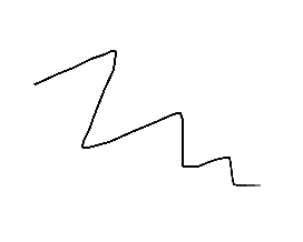
We observe "mousedown", "mousemove", and "mouseup" events on canvas. On "mousedown", we move pointer to clicked coordinates (ctx.moveTo). On "mousemove", we draw a line to new coordinates of a mouse (ctx.lineTo). Finally, on "mouseup", we end drawing by setting isDrawing flag to false. This flag is used to prevent drawing when just moving mouse on canvas (without first clicking it). You could avoid flag by assigning "onmousemove" event handler right in "onmousedown" one (and then removing it in "onmouseup"), but flag is a simple solution that works just as well.
Smooth connections
Well, that's a start. Now, we can control the line thickness by changing value of ctx.lineWidth. However, with thick line comes thick responsibility jagged edges. This happens on "sharp turns" and can be solved by setting ctx.lineJoin and ctx.lineCap to "round" (see MDN for examples of how these affect rendering).
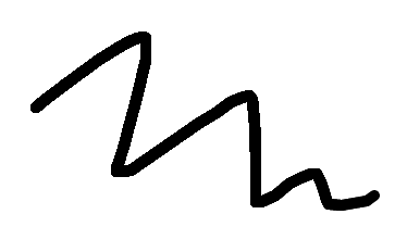
Edge smoothing with shadows
Now the lines are not jagged around corners. But they aren't very smooth on the edges either. This is because there's no antialiasing hapenning here (controlling antialiasing on canvas has never been straightforward). So how do we emulate it?
One way to make edges smooth is with the help of shadows.
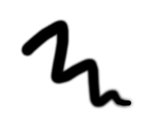
All we've added is ctx.shadowBlur and ctx.shadowColor. Edges are definitely smoother now, since lines are surrounded with a shadow. But there's still a little problem. Notice how line is thinner and blurry at the beginning but then becomes thicker and more solid at the tail. An interesting effect on its own, but perhaps not exactly what we want. So why does this happen?
Turns out this is due to shadows overlapping each other. Shadow from current stroke overlaps shadow from previous stroke which overlaps shadow from previous stroke, and so on. The more overlapping shadows, the less blurry and the thicker line is. So how would we go about fixing this?
Point-based approach
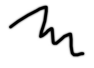
One way to avoid these kind of issues is to always stroke once. Instead of blindly stroking on every mousemove, we can introduce a state — store points in an array, and always stroke through them once.
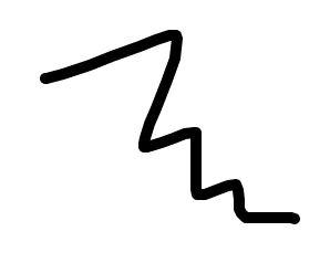
As you can see, it looks the same as the first example. Now we can try adding shadow here. Notice how it stays even throughout entire path.
Point-based with shadow
Edge smoothing with radial gradient
Another smoothing option is to use radial gradients. Gradients allow for more even color distribution, unlike shadows which often comes out more blurry than "smooth".
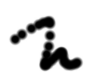
But, as you can see, stroking with gradient has other issues. Notice how we're simply filling area with circular gradient on each mousemove. When moving mouse quick, we get a sequence of disconnected circles rather than a straight line with smooth edges.
One way to solve this is by generating additional points whenever there's too much distance between any of them.
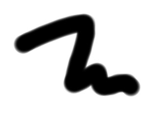
Finally a decently smooth curve!
You might notice a small change in the above example. Instead of storing all points of a path, we only store last one. And we always stroke from that last one to the current one. Having last point is all we really need to calculate the distance between it and the current one. If the distance is too large, we stroke more in between. The good thing about this approach is that we use less memory by not having entire points array!
Bezier curves
One interesting concept I came across was using bezier lines instead of straight ones. This allows for curves of a free-drawn path to be naturally smoother. The idea is to replace straight-line stroke with quadraticCurveTo, using middle point between two consecutive points as quadratic curve control points. Try it:
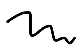
So there you have it: some basic variations of drawing and smoothing lines, from simple few-liner to more complex curve-based solution. Let's move on to something more fun.
Brush, Fur, Pen
One of the tricks in a realistic brush toolbox is to simply stroke with an image. I came across this technique in this blog post by Andrew Trice. The idea is to fill with an image of a little chunk of a stroke, using last-point-technique. This opens a huge number of possibilities.
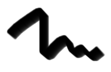
Depending on an image, we can achieve different brush styles. In this case, it's something resembling a thick brush.
Fur (rotating strokes)
An interesting twist (excuse the pun) to a previous technique is to fill path with same image but rotating it randomly every time it's rendered. If we do this, we can get something resembling a fur (or a garland?).
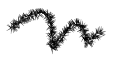
Pen (variable segment width)
When it comes to simulating a pen, a nice solution is to simply randomize segment width of a path! We can still use good-old moveTo+lineTo combination, but change "lineWidth" every time stroke occurs. Here's how it looks:
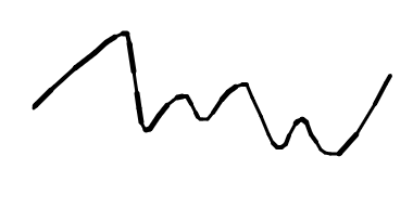
One thing to keep in mind is that, in order for drawing to look realistic, randomized values should be not too far apart.
Pen #2 (multiple strokes)
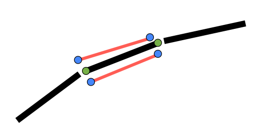
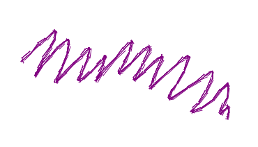
Another pen simulation is done via multiple strokes. Instead of stroking between points once, we add 2 more passes. But we don't want to stroke at the same spot, as that wouldn't change anything. Instead, we take couple random points (blue dots on a picture) next to original (green dots on a picture), and stroke from there. So instead of 1 line, we get 2 lines "sloppily" stroked right next to the original one. Perfect simulation of a pen!
Thick brush
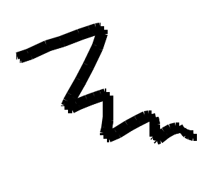
There's so much you can do with this "multiple stroke" technique. I urge you to try your own variations. Here's one example where, if we increase line thickness and offset 2nd pass just slightly, we get a simulation of a thick brush. Those blank spots on the edges is what makes it look realistic.
"Sliced" strokes
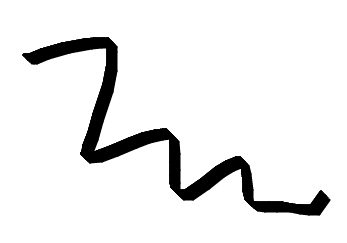
If we implement multiple strokes, but at even and small offsets, we can get something resembling a sliced brush again. This time, without using an image. The path simply comes out skewed.
"Sliced" strokes with opacity
If we take the same brush as in previous example, and give each stroke lesser and lesser opacity, we get an interesting effect like this.
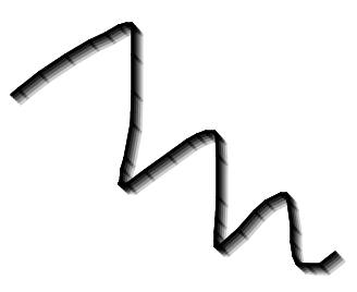
Multiple lines
But enough with straight strokes. Can we apply the same technique to, say, bezier-curve based path? Of course. We just need to draw each curve at an offset from the original points. This is how it looks:
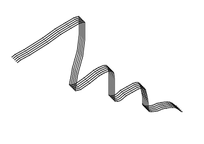
Multiple lines with opacity
We can also use same "fading" technique where each line has lesser opacity. This makes these lines look even more elegant.
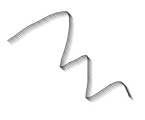
As with straight strokes, the possibilities with bezier curves are endless.
Stamp-like
Basic concept
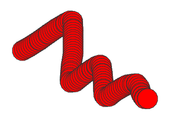
After we learned how to stroke lines and curves, implementing stamp brush couldn't be simpler! All we need is to draw certain shape on every mouse move, at a location of a mouse. That's it. Here's an example of stamping with a red circle.
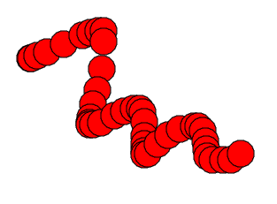
Trail effect
You can see the same issues with intermediate points, which we can solve with the same technique of prefilling. The prefilling in case of stamps tends to create pretty interesting trail-like or tube-like effects. You can control the density of a tube by changing interval at each points are prefilled between last point and current.
Random radius, opacity
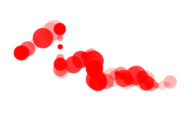
Of course we can always spice things up, changing each stamp in some way. For example, randomly varying radius and opacity in the 1st example gives us this.
Shapes
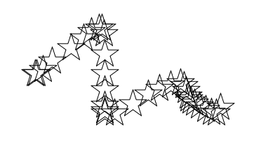
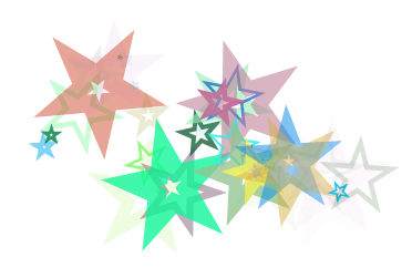
When it comes to the kind of stamp, you can really go as far as you can — anything from basic shapes (e.g. circle) like we've just seen to more complex paths, made of hundreds or thousands of curves. The only limiting aspect here is performance. Here's an example of stamping with a simple five-pointed star.
Shapes with rotation
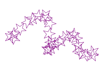
And here's the same star, but rotated randomly on each move, for a bit more natural feel.
Randomize everything!
Heck, let's radomize even more — size, angle, opacity, color, thickness! Now isn't that fun.
Colored pixels
We're also not limited to just shapes. One option is to manipulate pixels around mouse point directly. A simple example would be to just randomize their color and location.
![]()
Pattern-based brushes
Now that we went over stroking and stamping, let's take a look at a completely different beast — patterns. We can use canvas' createPattern filling the path with it as we go. This makes for some very interesting effects. Let's take a look at a simple dot pattern.
Dots pattern
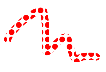
Notice how the pattern is created here. We're instantiating mini canvas, drawing circle on it, then using that canvas as a pattern on a main canvas! We might have just as well used a plain image, but the beauty of using canvas is that we have programmatic access to it and can change it anyway we like. This means we can create dynamic patterns, e.g. changing color of a circle in a patttern, its radius, etc. It also means that we can experiment with patterns quicker and easier.
Lines pattern
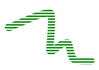
Based on previous example, you should be able to create something similar. Let's say a horizontal lines pattern.
Double-color lines pattern
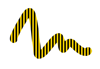
...or vertical lines, with interchanging colors.
Rainbow
...or even multiple lines with varying colors. Once again, everything is possible. Just think of some pattern and try to create it on a mini canvas. The rest is taken care by createPattern and path filling.
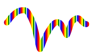
Image
Finally, here's an example of using image-based pattern together with bezier-curved path. All that's changed here is that we're passing an image object to createPattern (and then assigning resulting pattern to strokeStyle).
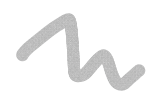
Spray
Now what about goold-old spray brush? There's few ways we can implement it. One of them is to simply fill area (pixels) around mouse point with color. The larger the area (radius), the thicker spray is. The more pixels we fill, the denser it is.
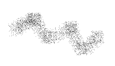
Time-based spray
You might notice that previous approach does not really paint like a real spray. A real spray paints area continuously, not just when we move a mouse/brush. In order to achieve this, we need to paint area at a constant interval while the mouse is pressed. This way, certain areas can be made darker just by "holding a spray" there longer.
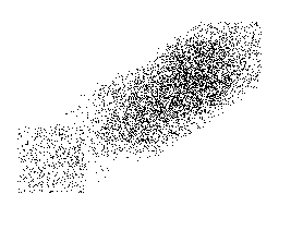
Time-based spray with round distribution
The previous example is more realistic but not fully so. Real spray throws paint over a round area, not rectangular. So let's try to distribute pixels over a round area.
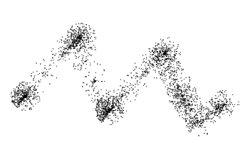
Much better.
Randomizing dots
Finally, is there anything else we can do to make spray more realistic? Aside from using an image as a stamp, of course. We can certainly make paint spread out even more sporadically, as it would in a real life. If we change opacity of each of the painted pixels, we get a very similar effect.
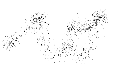
Neighbor points connection
The concept of connecting neighbour points was popularized by zefrank's Scribbler and Mr. doob's Harmony. If you remember Harmony brushes like sketchy, shaded, chrome — that's the effect I'm talking about.
The idea is: add additional strokes between nearby points of already drawn path. This usually creates an effect of a sketch, or a web, or a shading of some sort; additional strokes add illusion of darker spots in small, "bended" areas.
All-points connection
A naive approach would be to take our first simple example of point-based brush, and add extra stroking. For each point along the path, we would stroke towards one of previous points on a path:
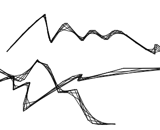
You can kind of start to see something resembling Harmony's brushes, but it's not exactly the same. It could be made better by reducing opacity (i.e. contrast) of additional strokes, to make them more realistic and shadowy. But to recreate effect fully, we need to follow a different algorithm.
Neighbor points
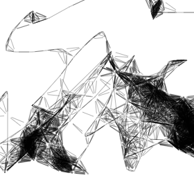
The part responsible for "nearby" stroking is this:
  var lastPoint = points[points.length-1];

  for (var i = 0, len = points.length; i < len; i++) {
    dx = points[i].x - lastPoint.x;
    dy = points[i].y - lastPoint.y;
    d = dx * dx + dy * dy;

    if (d < 1000) {
      ctx.beginPath();
      ctx.strokeStyle = 'rgba(0,0,0,0.3)';
      ctx.moveTo(lastPoint.x + (dx * 0.2), lastPoint.y + (dy * 0.2));
      ctx.lineTo(points[i].x - (dx * 0.2), points[i].y - (dy * 0.2));
      ctx.stroke();
    }
  }
What's going on here? Looks crazy. Took me a while to understand but the concept is strikingly simple!
When drawing a line, we check entire distance of already-drawn path comparing all the points to the current (last) one. If the point is in certain proximity (d < 1000) of a last one, we move pointer to it and stroke a line from there to the current point. dx * 0.2 and dy * 0.2 give those additional strokes a bit of offset.
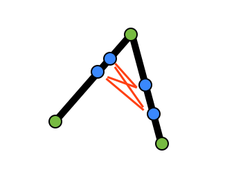
That's it. Simple idea, powerful effect.
Fur via neighbor points
An interesting twist to this technique — seen in Harmony — is to create fur effect. Instead of stroking towards the nearby point (from the last one), the stroke is made to the opposite direction. With a little bit of offset, it produces furry strokes around certain (close) areas.
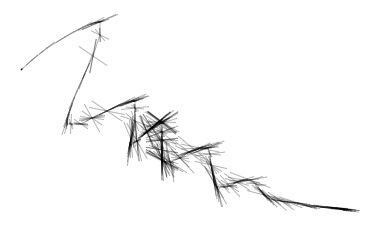
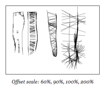
Shortly after investigating Harmony brushes, I came across this wonderful blog post by Lukáš Tvrdý, explaining nicely some of the variations of neighbor-points technique. He describes how different parameters affect the strokes and the kind of effects they produce. Definitely worth checking out.
So there you have it — some of the basic as well as more interesting drawing techniques. We've only scratched a surface here. There are endless possibilities to customize either of the brushes, creating even more exciting effects. Change opacity or color, width or offsets, introduce random factor, and a whole new effect is born.
Try experimenting with them on your own!
Did you like this? Donations are welcome
comments powered by Disqus